
You pull up a heatmap of your store’s surroundings. It’s full of color: deep red blobs here, faint yellow patches there, a gradient that looks impressive in a slide deck. But what is it actually telling you? And more importantly, what should you do differently because of it?
Heatmaps are one of the most visually compelling tools in location intelligence, and also one of the most commonly misread. Used well, they can reshape how you think about staffing, marketing timing, and even store layout. Used poorly, they are just a pretty picture.
Contents
What a Heatmap Actually Shows You
At its core, a heatmap visualizes density. Depending on what data feeds it, that density could represent foot traffic, mobile device pings, transaction counts, or population concentration. The color intensity tells you where activity is concentrated and where it thins out.
The most useful heatmaps for retail combine mobility data, where people actually move throughout the day, with a geographic grid, often hexagonal cells, so that every area around your store gets a comparable score. Darker cells mean more activity. Lighter cells mean less.
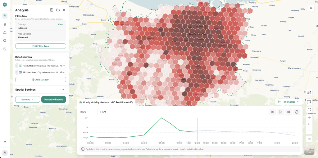 Figure 1: Semarang’s Hourly Mobility Heatmap
That sounds simple, but the real value only shows up once you break the density down by hour. An hourly heatmap like the one above does not just tell you where activity concentrates. It shows how that concentration shifts across the day, so you can tell whether an 8 AM spike comes from commuters rushing past or an afternoon build-up comes from residents actually stopping to shop. That hour-by-hour view is what turns a heatmap from a static picture into a pattern you can plan staffing, promotions, and store hours around.
Reading the Map Without Misreading It
The biggest mistake retailers make with heatmaps is assuming density equals opportunity. A hexagon with heavy foot traffic at 8 AM might be full of commuters rushing past, not shoppers who are willing to stop. A quieter zone in the afternoon might actually convert better because the people moving through it are residents doing errands, not people in transit.
A useful heatmap, in other words, needs context. Worth asking:
- What time of day does this density represent? Morning commute patterns look nothing like weekend leisure patterns.
- Who is generating this density? Office workers, residents, students, and tourists all behave differently once they are near a store.
- Is this density passing through, or stopping? High movement volume on a main road is not the same as foot traffic that actually slows down near storefronts.
From Visualization to Decision
Once you can read the map correctly, it becomes a planning tool rather than a pretty visual. Some practical applications:
- Staffing schedules: align your busiest shift hours with the hours your heatmap shows the highest nearby density, rather than relying on historical guesswork.
- Promotional timing: if density peaks in the late afternoon on weekdays, that is when a flash promotion or in-store activation will reach the most people.
- Window displays and signage: a storefront facing the direction where density consistently builds deserves more visual investment than one facing a quiet side street.
- New location scouting: comparing density patterns across candidate sites gives you an apples-to-apples way to shortlist locations before deeper analysis.
Common Misreadings to Avoid
A few habits separate teams that get real value from heatmaps from those who just admire them:
- Treating one snapshot as the full picture: density shifts by day of week, season, and even weather. A single map captured on one afternoon is a sample, not the truth.
- Ignoring the denominator: a hexagon with high density next to ten competing stores is a very different opportunity than the same density next to none.
- Skipping the ground check: heatmaps are a strong starting signal, but a short site visit can confirm or challenge what the data suggests.
Where Heatmaps Fit in Your Bigger Toolkit
Heatmaps are rarely the whole answer. They work best stacked with other layers: POI data to see what is actually nearby, demographic data to understand who lives and works in the area, and competitor mapping to see who else is already competing for that density. On their own, heatmaps show you where people are. Combined with the rest of your data, they help you understand why, and what to do about it.
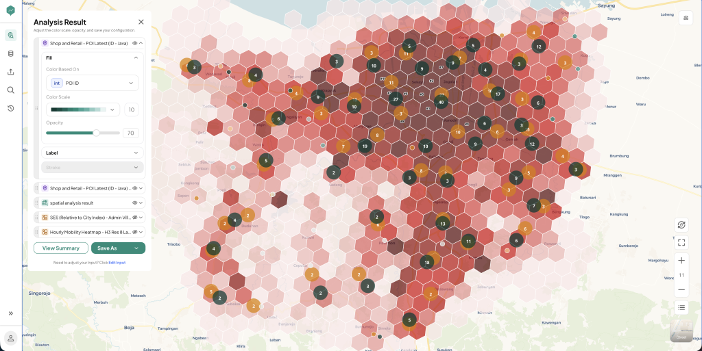 Figure 2: A Multi-Layered View of Customer Density Around a Store
Platforms like LOKASI Intelligence build heatmaps this way by default, layering mobility data with POI and demographic context so the colors on the map come with an explanation, not just an impression. In a layered view like Figure 2, the shading still marks where density concentrates, but the POI pins on top show what is already competing for that density, and the demographic overlay tells you who lives or works nearby. A busy hexagon sitting next to five competitor pins tells a very different story than an equally busy hexagon with almost no competition and a dense office population around it. That is the kind of insight a plain, single-layer heatmap cannot give you.
Want to see what a density heatmap of your own trade area actually looks like? Bvarta’s team can walk you through a live read of your store’s surroundings.
FAQ
How often should a retail heatmap be updated?
Mobility patterns shift with seasons, new developments, and infrastructure changes, so refreshing the heatmap every few months is a reasonable cadence for most retailers. Faster-changing areas, like those near new transit lines or large developments, may need more frequent updates.
Can a heatmap tell me if a location will be profitable?
Not on its own. A heatmap shows where activity concentrates, but profitability depends on additional factors like rent, competition, and whether the people generating that density actually match your target customer. Treat it as one input among several, not a standalone answer.
What is the difference between a foot traffic heatmap and a population density heatmap?
A foot traffic heatmap reflects movement, people actually passing through or near a location, often based on mobile mobility data. A population density heatmap reflects where people live or are registered, based on census or demographic data. Both are useful, but they answer different questions: one is about activity, the other is about residency.
Do I need a data science team to read a heatmap correctly?
No. Most modern location intelligence platforms present heatmaps with enough context, layered POI, time filters, demographic overlays, that a business owner or marketer can interpret them without a technical background. The key is asking the right questions about what generated the pattern, not running the analysis yourself.