
Contents
- 1 What Underserved Actually Means
- 2 The Data Layers That Reveal Underserved Markets
- 3 Spotting the Pattern: Demand Without Supply
- 4 Common Pitfalls When Hunting for Underserved Markets
- 5 From Insight to Market Entry Plan
- 6 FAQ
- 6.1 How is an underserved market different from a simple distribution gap?
- 6.2 Can a market be underserved even if competitors are already present there?
- 6.3 How do you tell the difference between an underserved market and one with genuinely low demand?
- 6.4 How often should underserved market analysis be repeated?
- 7 References
What Underserved Actually Means
It is tempting to define an underserved market simply as an area where your product is not sold. But that definition misses a lot of nuance.- True whitespace: strong demographic and demand signals, but no meaningful distribution at all. This is the clearest opportunity.
- Weak format fit: your product is present, but only through outlet types that do not match how the local population actually shops, for example only in supermarkets in an area dominated by warung-based daily shopping.
- SKU mismatch: distribution exists, but the wrong pack sizes or variants are on the shelf for that area’s income profile and household composition.
The Data Layers That Reveal Underserved Markets
Spotting any of these patterns requires looking at more than sales figures. The data layers that matter most are:- Demographic fit: income level, household size, and age distribution compared against the profile of your existing best-performing markets.
- Mobility and consumption signals: how people move through an area and what kinds of destinations they frequent, which often hints at lifestyle and spending patterns before sales data ever shows it.
- Competitor saturation: how heavily competitors have already covered the area, since low competitor presence alongside strong demographic fit is a much stronger signal than low competitor presence alone.
- Existing distribution penetration: how many outlets in the area currently carry your product, and what types they are, compared to the total outlet universe there.
Spotting the Pattern: Demand Without Supply
The clearest underserved markets show a specific pattern: demographic and mobility signals that closely resemble your strongest existing markets, combined with distribution penetration and competitor presence that are both low. When all four layers line up this way, the area is very likely leaving real, attainable demand on the table.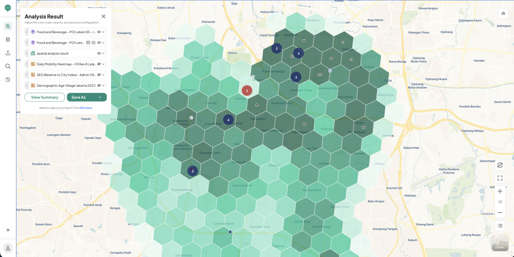 Figure 1: Ranking by Gap Score: a LOKASI Intelligence hexagon grid view of a Jakarta area, combining competitor POI, mobility, SES, and demographic layers to highlight the sub-areas with the strongest demand-to-supply gap.
When only some of the layers line up, like strong demographics but heavy competitor saturation, the opportunity is murkier and probably requires a different kind of entry strategy, focused on differentiation rather than simply showing up first.
The map above shows a sample LOKASI Intelligence output for a service area spanning South and Central Jakarta. Each hexagon’s shade reflects its combined opportunity score, built from food and beverage competitor POI density, a daily mobility heatmap, an SES index relative to the city average, and demographic age distribution. The numbered markers flag the hexagons with the strongest gap score, the cells where demand signals are highest relative to existing competitor coverage, turning the analysis into a ranked shortlist instead of a single yes or no answer.
Figure 1: Ranking by Gap Score: a LOKASI Intelligence hexagon grid view of a Jakarta area, combining competitor POI, mobility, SES, and demographic layers to highlight the sub-areas with the strongest demand-to-supply gap.
When only some of the layers line up, like strong demographics but heavy competitor saturation, the opportunity is murkier and probably requires a different kind of entry strategy, focused on differentiation rather than simply showing up first.
The map above shows a sample LOKASI Intelligence output for a service area spanning South and Central Jakarta. Each hexagon’s shade reflects its combined opportunity score, built from food and beverage competitor POI density, a daily mobility heatmap, an SES index relative to the city average, and demographic age distribution. The numbered markers flag the hexagons with the strongest gap score, the cells where demand signals are highest relative to existing competitor coverage, turning the analysis into a ranked shortlist instead of a single yes or no answer.
Common Pitfalls When Hunting for Underserved Markets
A few habits lead teams to chase the wrong opportunities:- Equating low sales with low demand: an area can show weak sales purely because distribution never reached it properly, not because consumers there do not want the product.
- Equating no competitors with no demand: sometimes an area is genuinely empty of competition because there genuinely is not enough demand to support a presence. Distinguishing these two cases is exactly what the demographic and mobility layers are for.
- Treating a city or region as one unit: a city can be underserved in some sub-districts and saturated in others. Aggregating to the city level hides exactly the contrast you are trying to find. The same German study found that supply gaps showed up just as often in smaller towns and peri-urban districts as in big cities, precisely because city-level analysis would have masked them (Tudor, 2025).
From Insight to Market Entry Plan
Once a genuinely underserved area is identified, the next step is translating the insight into an entry plan: which channel types to prioritize first, which SKUs fit the local profile, and which distributor or sales team is best positioned to cover it. Location intelligence helps identify where to look. The commercial plan still has to define how to show up once you get there. Several LOKASI features map directly onto these decisions:- Outlet and channel mapping: POI data showing which channel types, from warung to minimarkets to supermarkets, already dominate a sub-area, pointing to which channel to prioritize first.
- SES segmentation: spending tier data by sub-area, helping match pack size and price point to what the local population can actually afford
- Mobility and territory mapping: daily movement data that helps define a realistic coverage boundary for whichever distributor or sales team takes on the area.